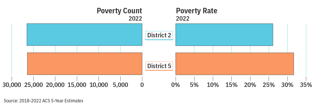
Council Districts and neighborhoods in Detroit range in size, number of parcels, and population count. These differences impact how we interpret data describing these places. For example, Council Districts 2 and 5 have similar counts of people living under the poverty line, 26,520 and 26,415 respectively. If we just looked at those counts, we might assume that the populations face poverty at similar levels. However, Council District 2 has a population of 102,939 and Council District 5 has a population of 86,847. This means that District 5 residents are more likely to be under the poverty line. By dividing the number of people under the poverty level by the total population, we see that 26.1% of people living in Council District 2 and 31.7% of the population in Council District 5 are under the poverty line, showing us a difference in the density of poverty within those Council Districts.
By using different ways to look at numbers like per capita, we create easier comparisons of raw numbers that don’t favor more highly populated communities or ignore less populated communities.
Since the Neighborhood Vitality Index (NVI) is meant to help communities understand what their greatest assets and needs are, it makes sense in some cases to ensure they are considering the full context of their community within Detroit. In many cases, this is reported as a percentage of residents who responded to the survey. In other cases, it requires slightly more analysis to ensure that communities with higher or lower levels of population properly understand the data within the context of their own community. To solve this problem, we use a concept called normalizing data.
Data is often used to determine the best places to allocate resources, measure progress towards a goal, and understand community needs. Successfully developing programming and investments often requires comparing data between places. Normalizing data means we create a new number that takes into account the differences that might exist across geographies. Exclusively using raw numbers, like 10,000 people living under the poverty level or 5,000 kids living in this community will usually fall short when trying to prioritize communities because the numbers will always skew towards areas with higher populations.
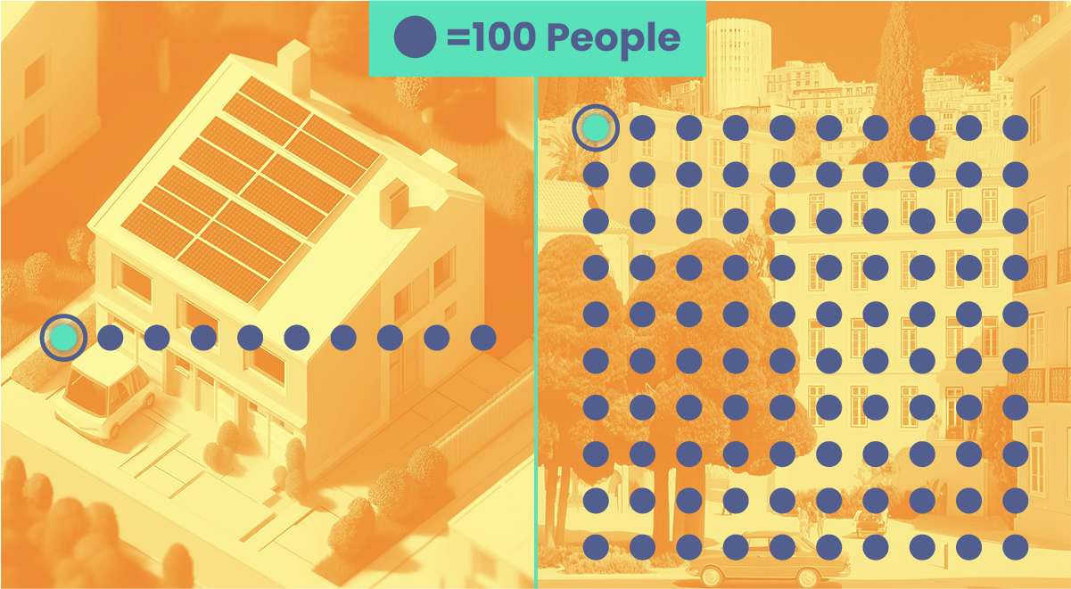
The most common way to normalize data is to provide a number per a certain number of residents, or a per capita rate. Using raw numbers can mask hot spots in areas with lower populations or create a false sense of concern in areas with higher populations. As the graphic below shows, 100 instances in a smaller, less populated community with many single-family homes, represent a much larger portion of the population than 100 instances in a more populated area with large, dense apartment-style housing.
When you consider the “per capita” count, the lower population community is 100 cases per 1,000 people where the high population community is 1 case per 1,000 people.
The NVI reports a wide variety of data points for communities to explore. Many of these are reported as percentages. Here we’ll describe some of the normalized datapoints and how they can be interpreted. In the NVI, you’ll find per capita data points like the number of building permits issued per 10,000 residents, automobile crashes per 10,000 residents, and number of accidents involving pedestrians per 10,000 residents.
The first per capita number is found in the Neighborhood Conditions index: the number of building permits issued per 10,000 residents. In this case, we could just report the total number of building permits within each geographic area; however this would cause more densely populated neighborhoods to seem to have higher numbers than less densely populated ones. Revisiting our Council Districts 2 and 5 example, we can see that Council District 2 has 102.8 building permits per 10,000 residents and Council District 5 has 140.3 building permits per 10,000 residents. If we looked at the raw numbers, they would be much closer since Council District 2 has more people.
We also report the number of violent crimes per 10,000 residents. This achieves a similar goal, allowing neighborhoods with smaller populations to get a better sense of whether they’re above or below the citywide crime rate.
When we look at pedestrian and automobile crashes, it stands to reason that higher density communities would have more accidents. When we normalize these numbers, we can start to see if there are possibly lower density communities with less safe roads. Those neighborhoods would not be apparent because they would have less accidents overall.
Overall, the NVI is a tool for communities to support resource allocation for resources they might need to maximize residents’ satisfaction with their neighborhood. Using per capita rates to normalize certain data points helps ensure that communities are able to understand their position within the context of the city as a whole, and better advocate for their needs.